Sky New Zealand - 2026 Neon Rebrand
Role
Creative Design
Neon's rebrand was driven by a clear strategic opportunity: in an increasingly crowded streaming market dominated by global platforms, the service needed a more distinctive position.
The refresh was designed to move Neon beyond content aggregation and establish it as a genuinely Kiwi voice in entertainment - one with a clear point of view, a recognisable identity, and a brand strategy capable of matching the quality of its content.
As part of the Sky design team, early ideation sessions with Special Group involved exploring campaign copywriting directions and contributing to the creative concepting phase ahead of the rebrand rollout.
ThoughtFull defined the core brand foundations - typography, colour palette, and visual language - with the focus then shifting to translating that new identity into public-facing assets.
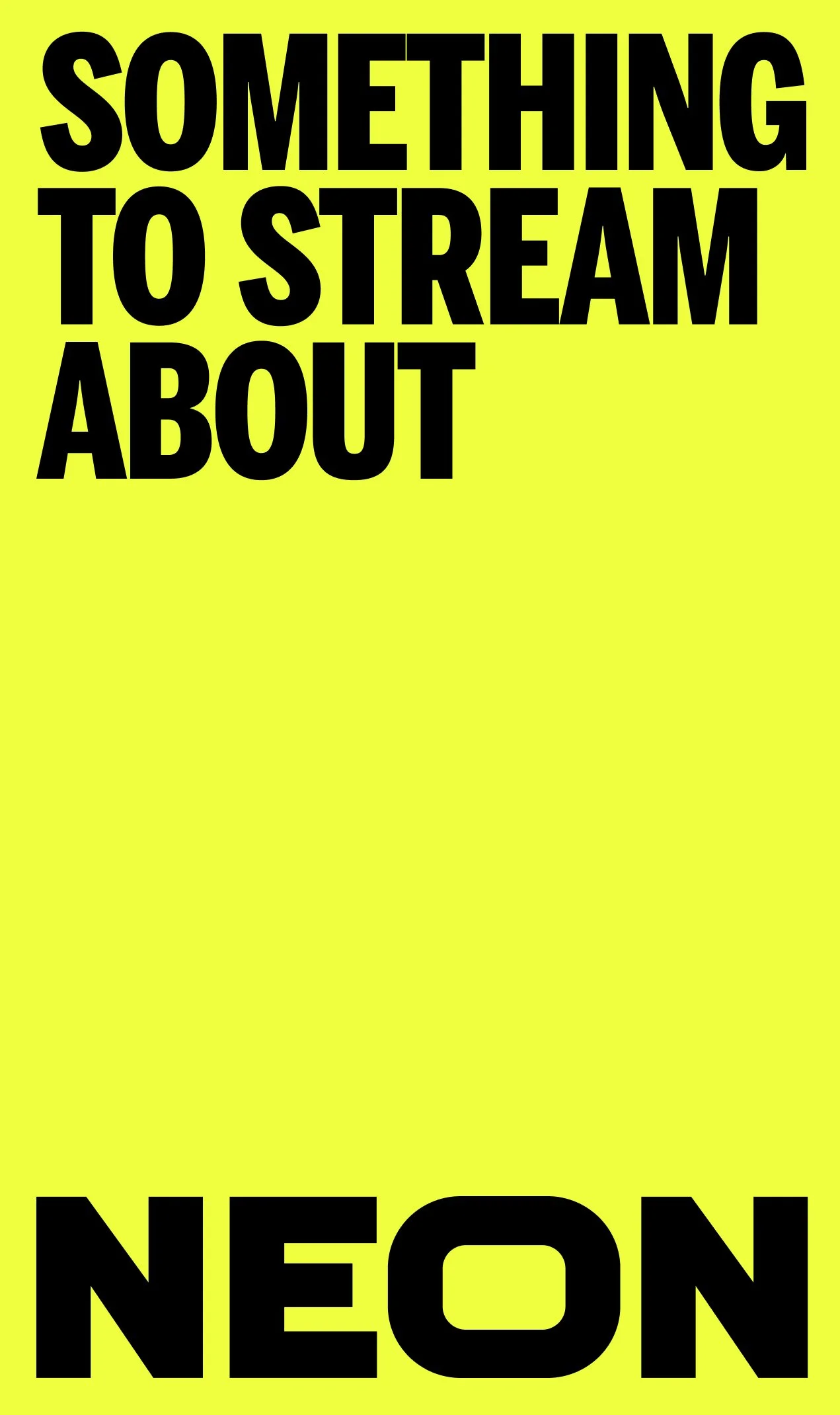
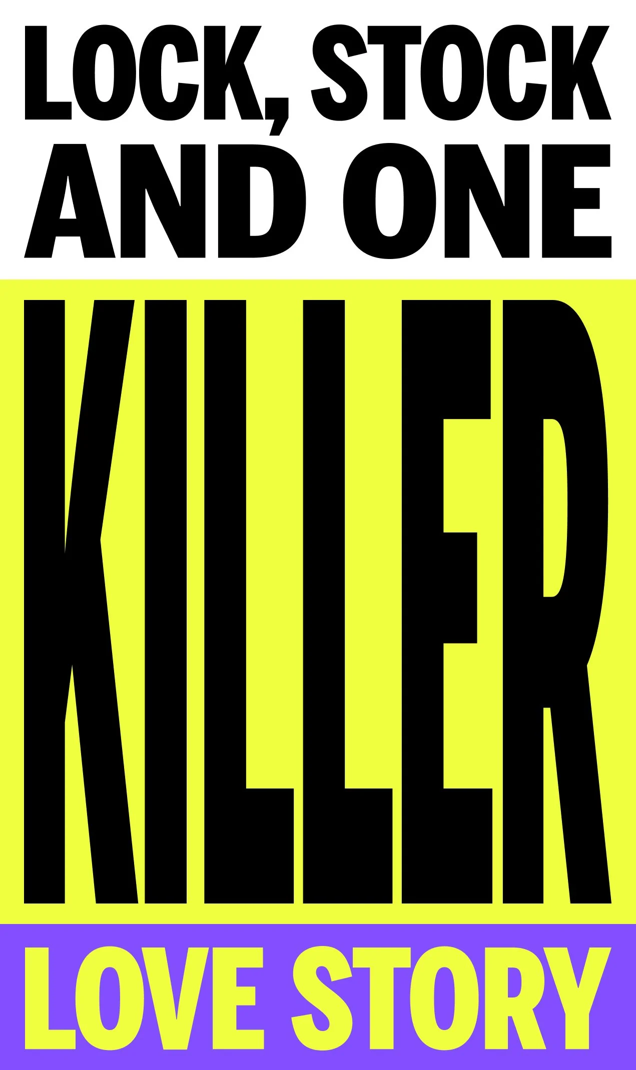
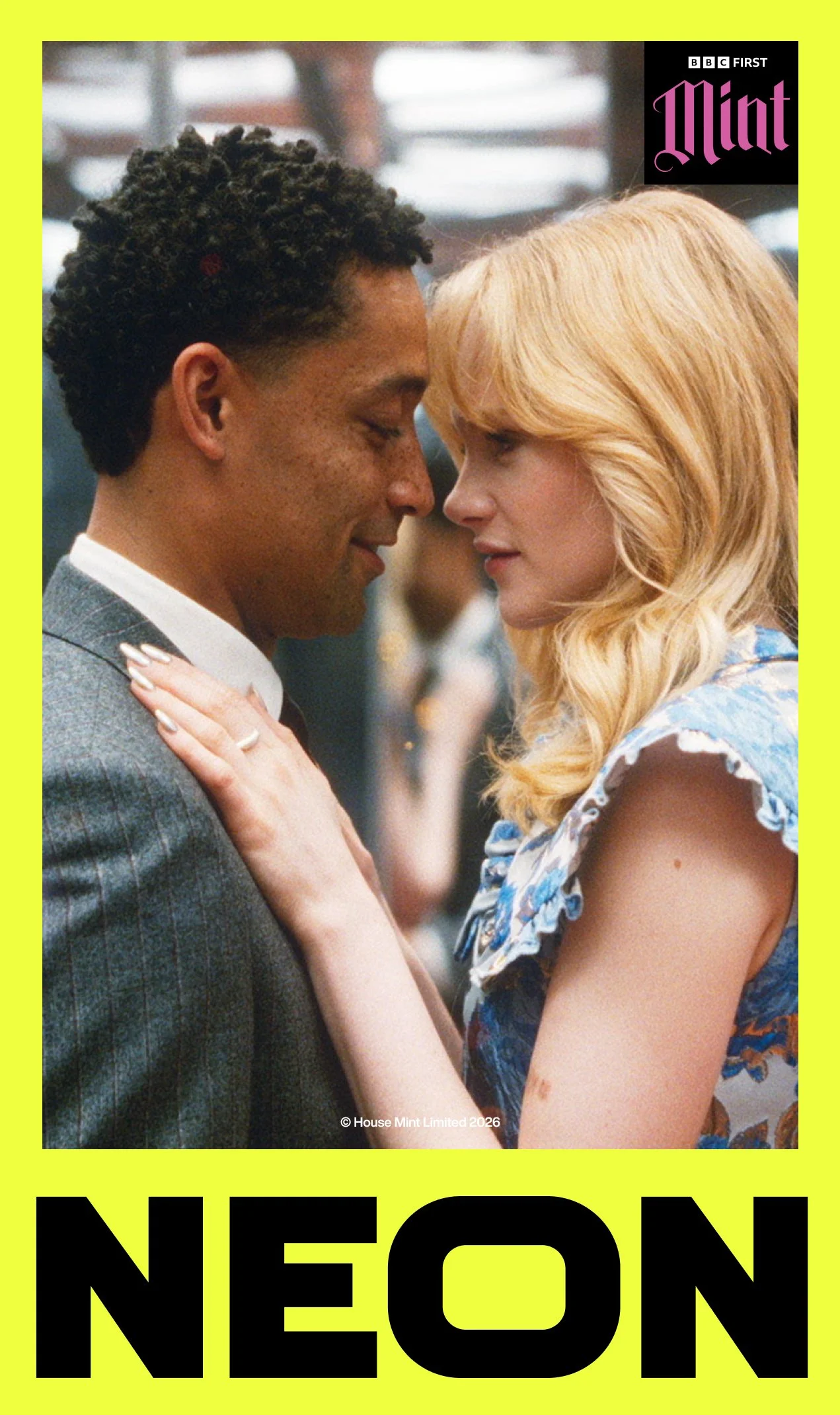
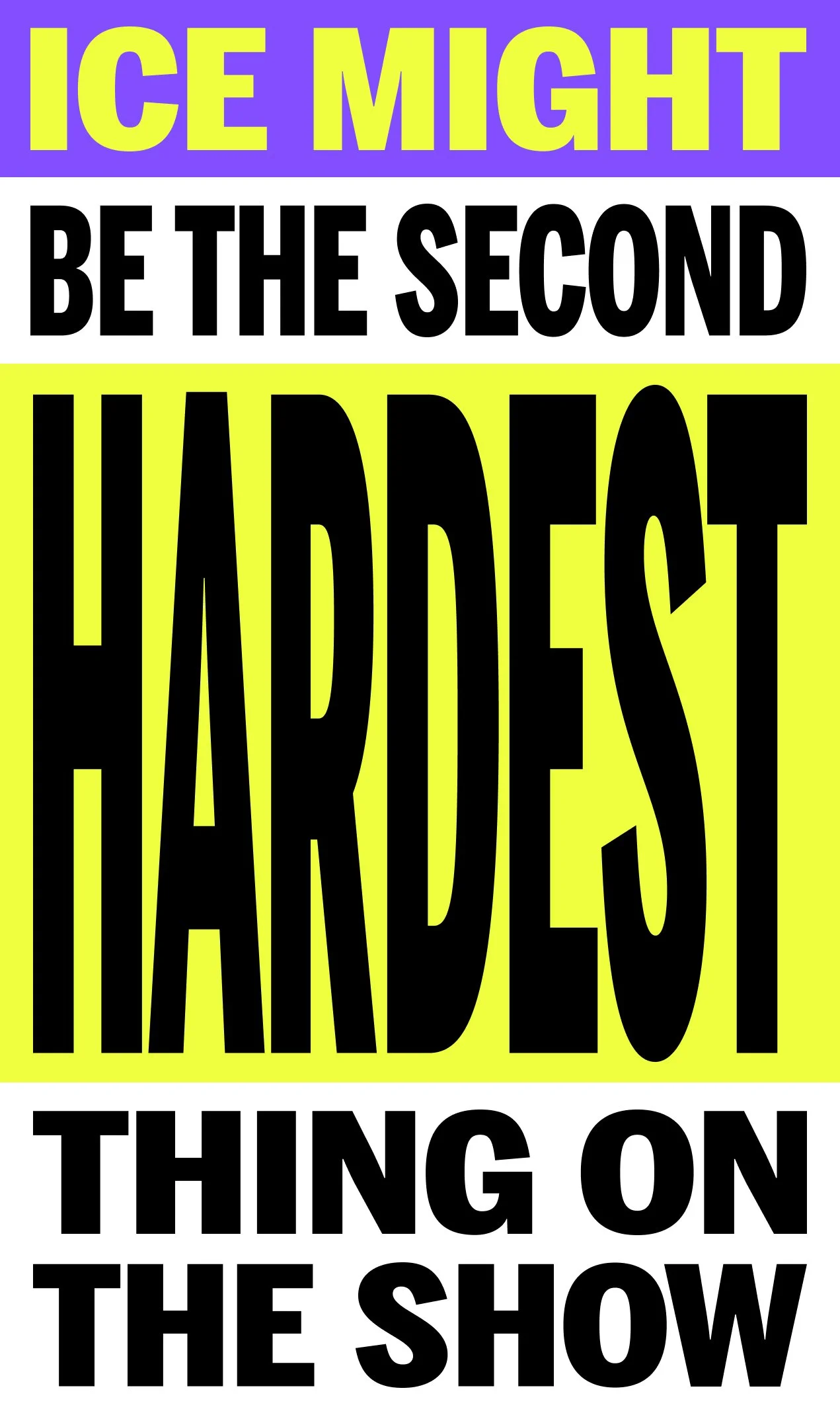
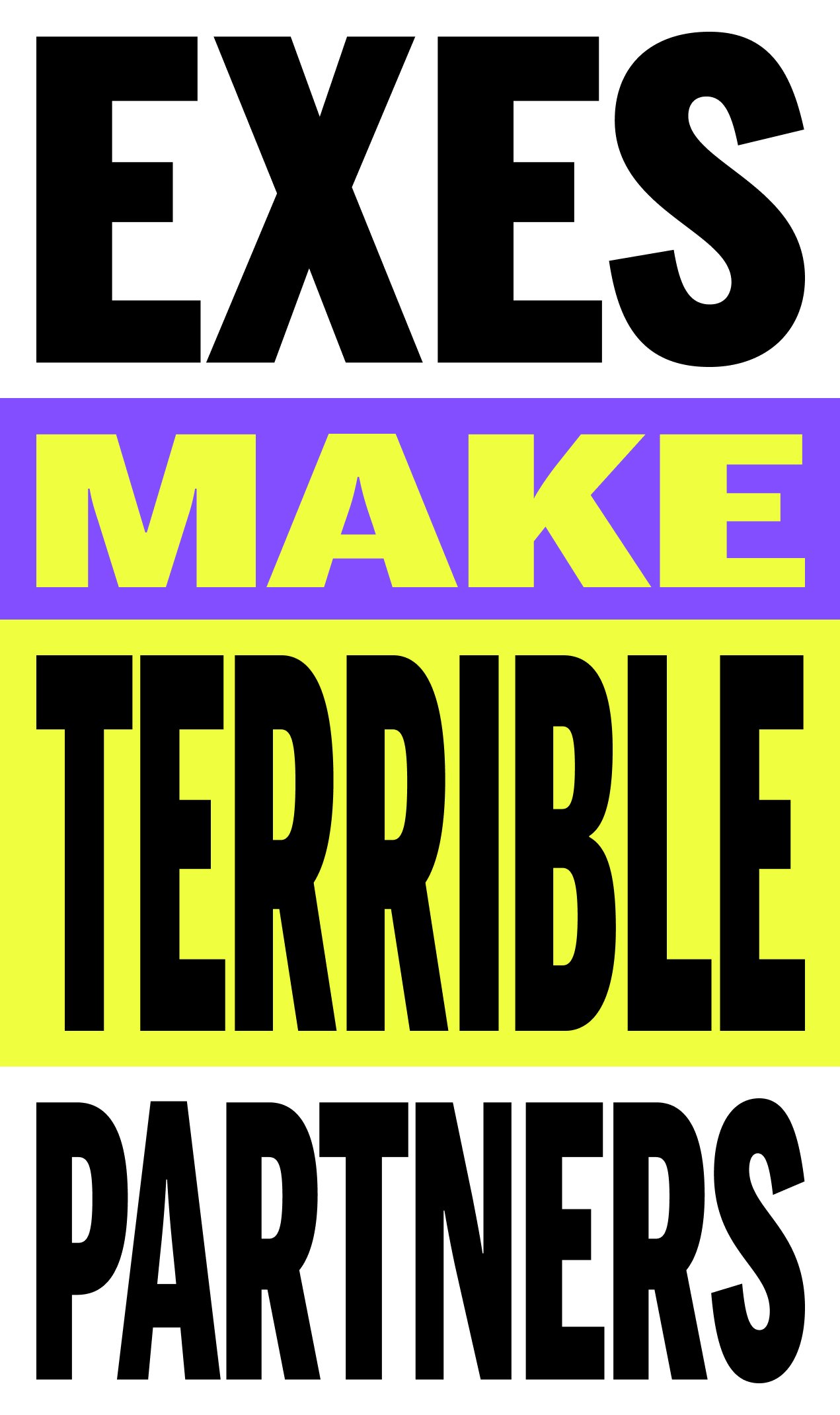
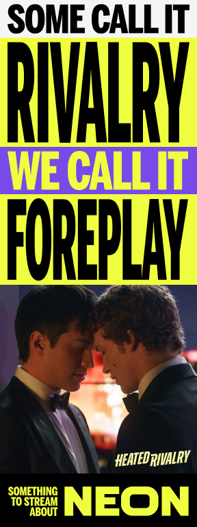
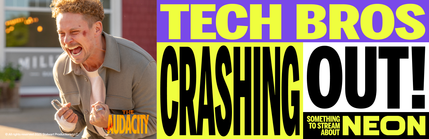
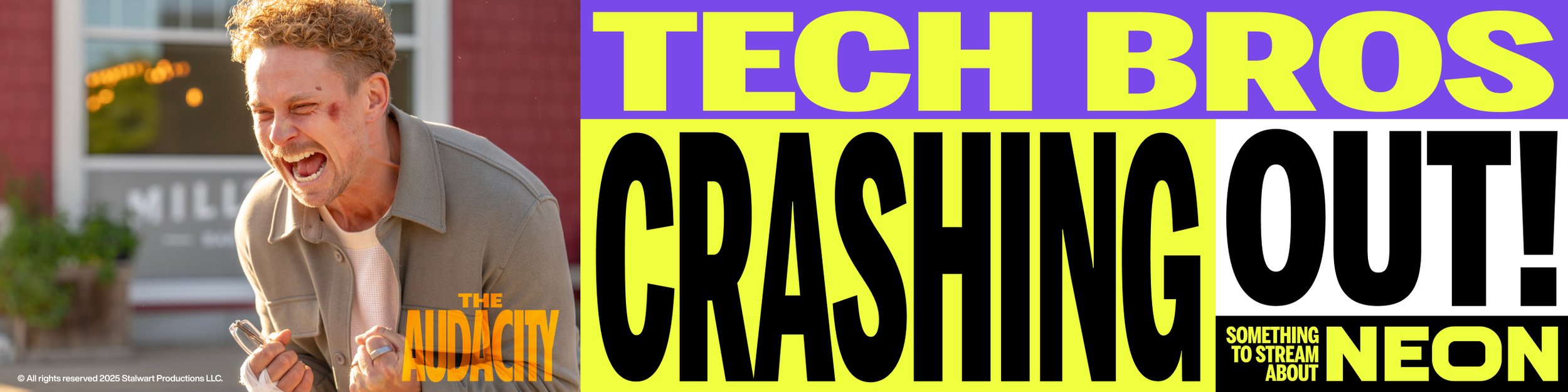
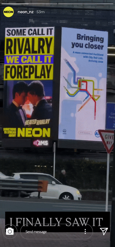
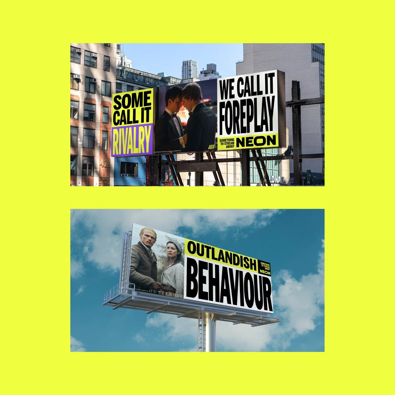
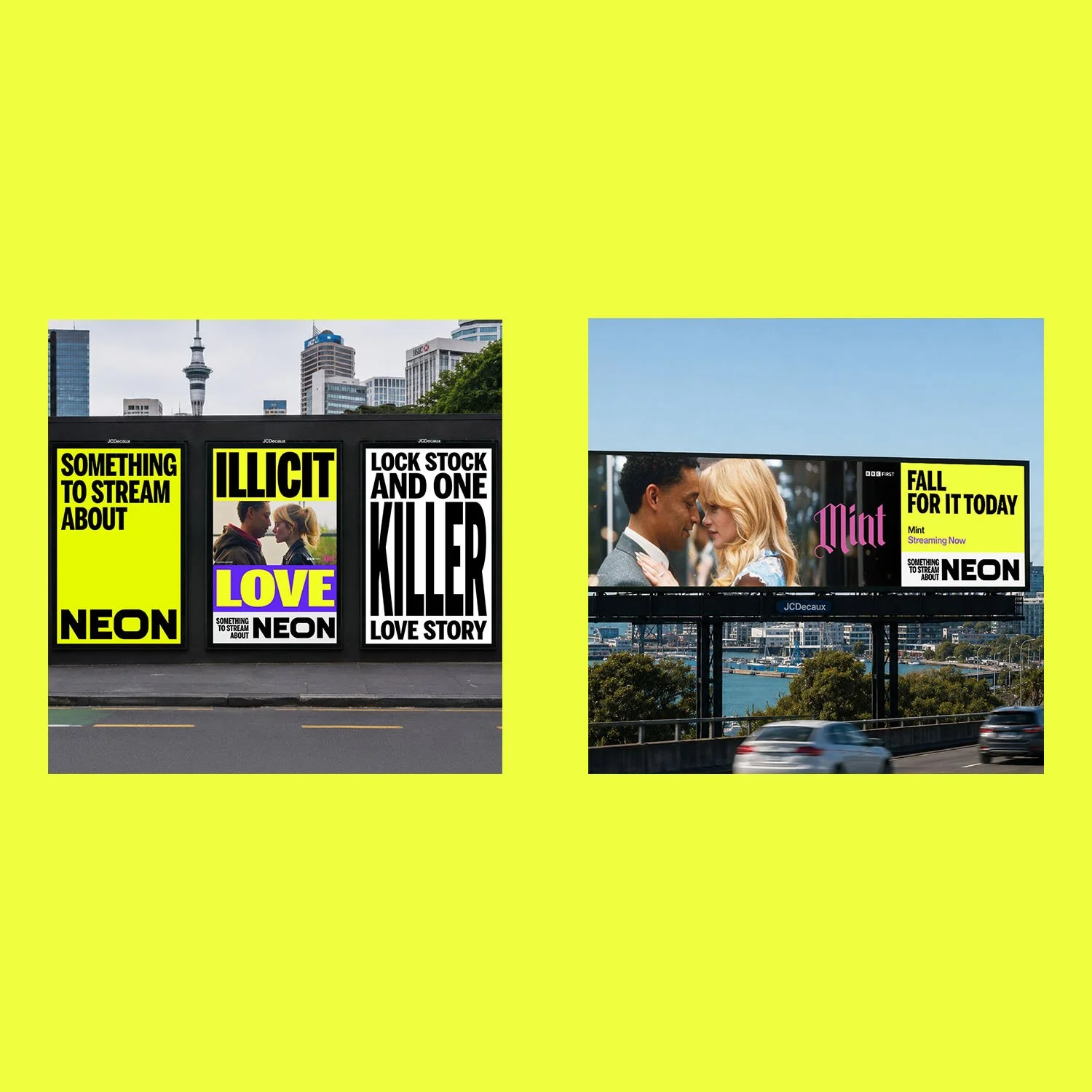
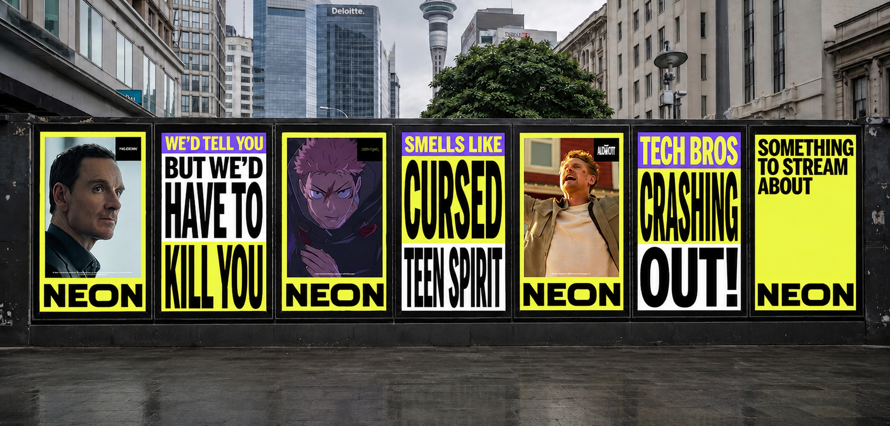
The result was Something to Stream About: a campaign platform and tagline that tapped into the cultural conversations New Zealanders were already having about the shows they love.
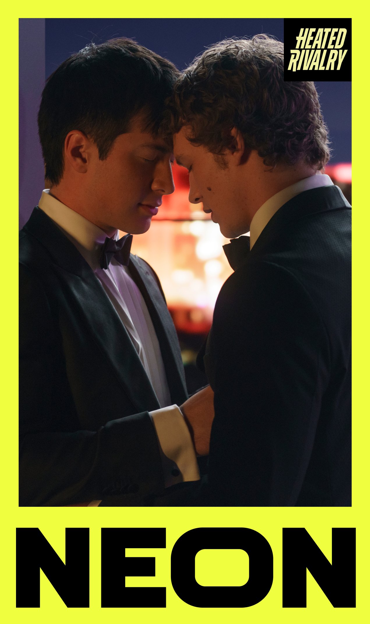
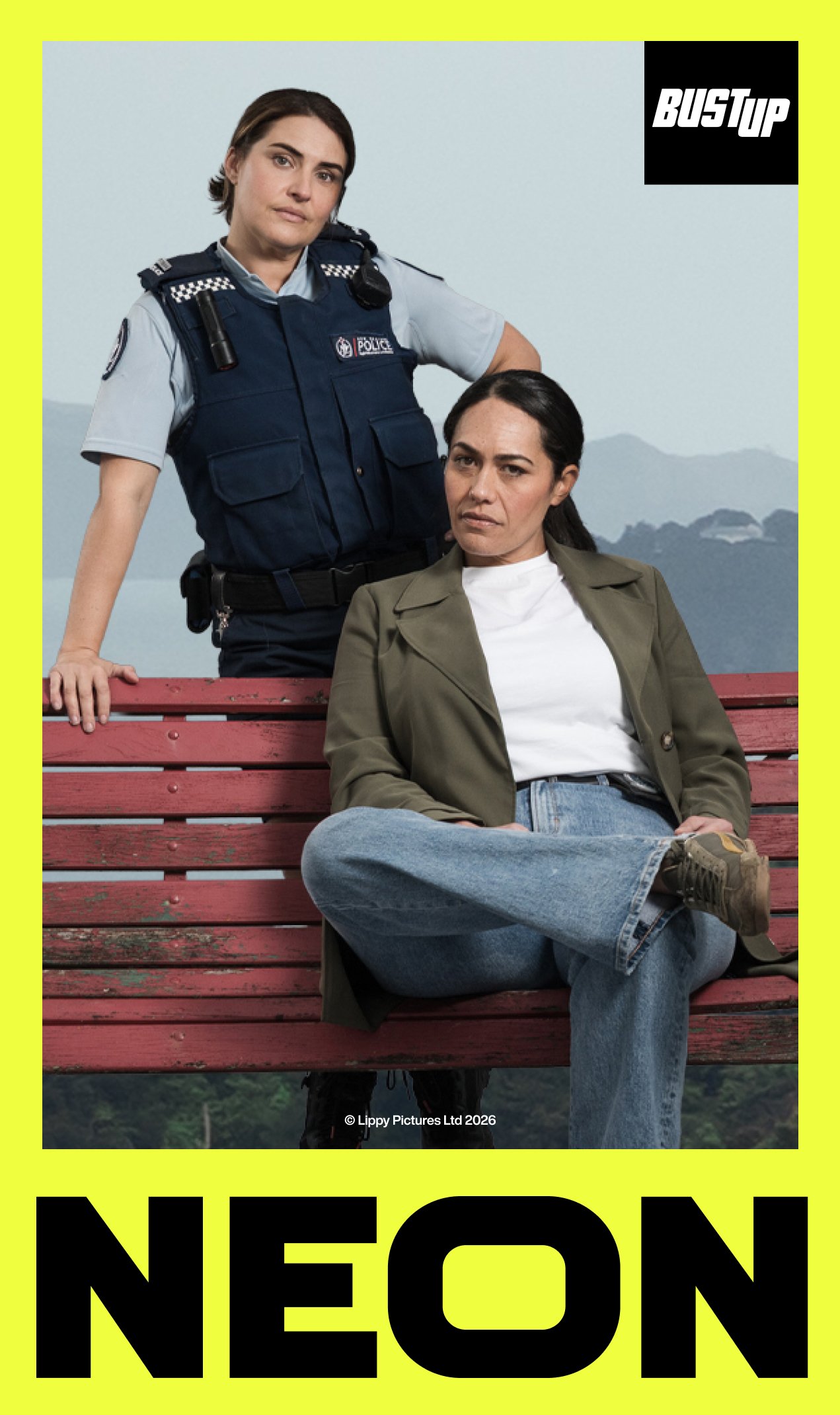
The primary output was out-of-home execution - billboards and street posters that formed the public's first impression of the refreshed NEON brand.

The campaign launched
to strong results within
its first five months:
24.1m ad impressions
54k clicks
1.5m web sessions
25.8k total conversions

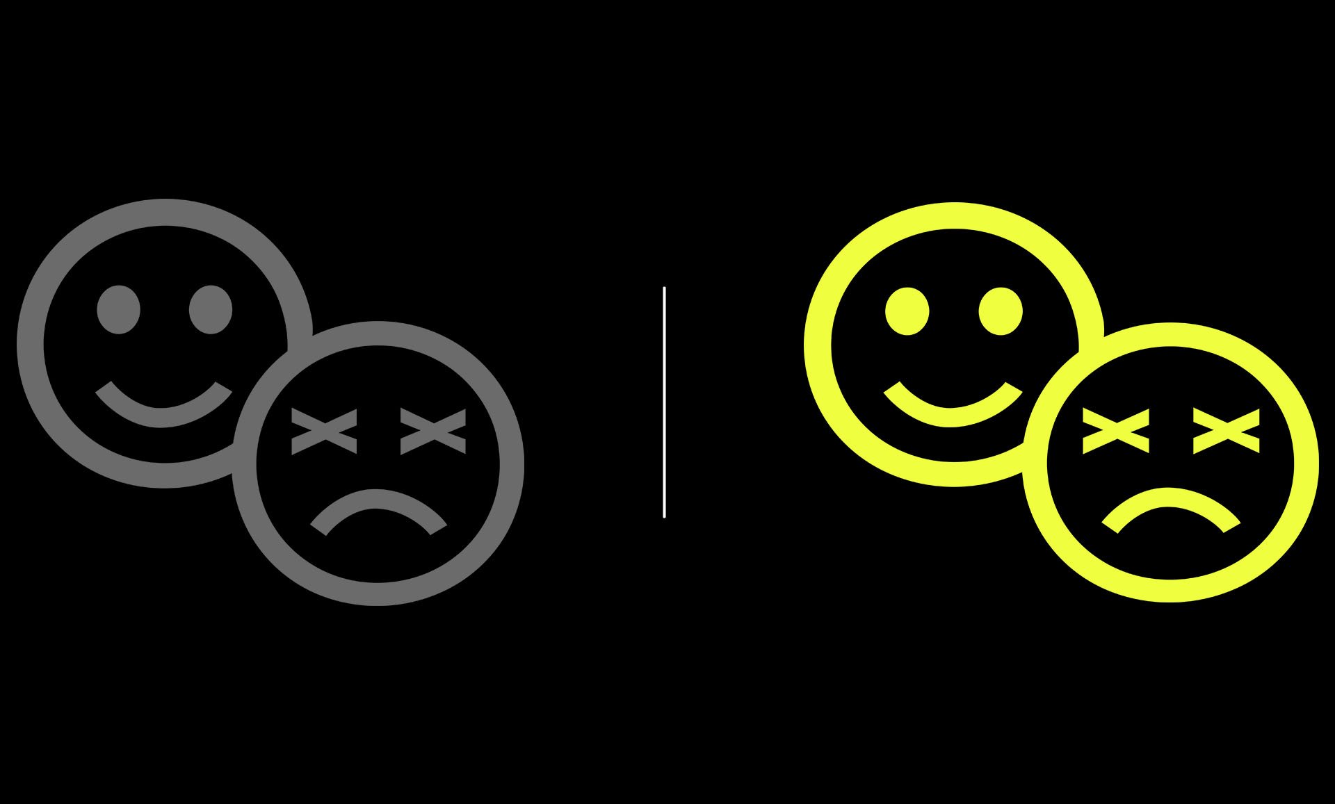
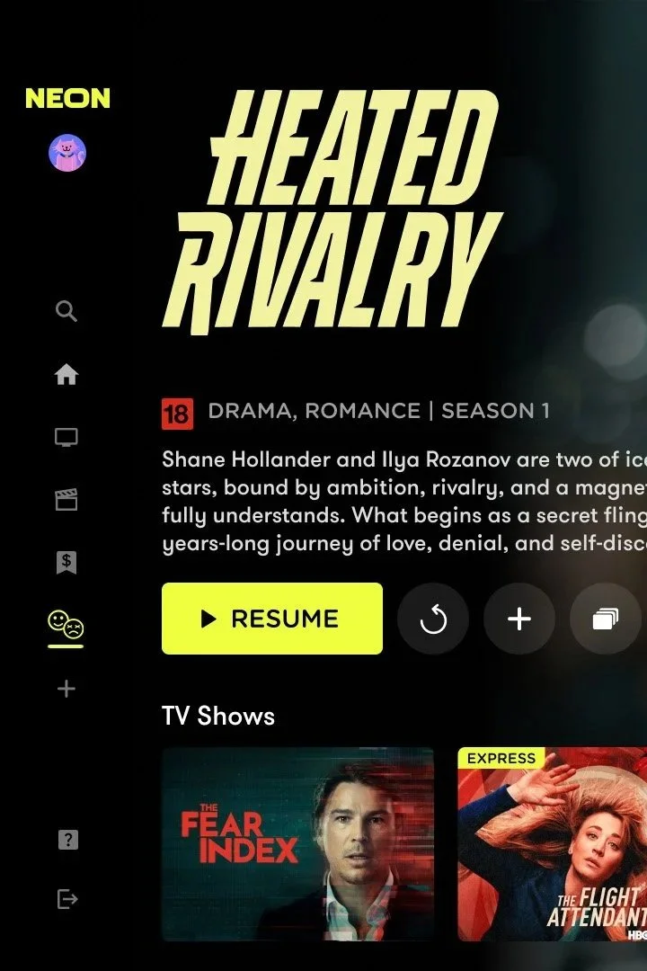
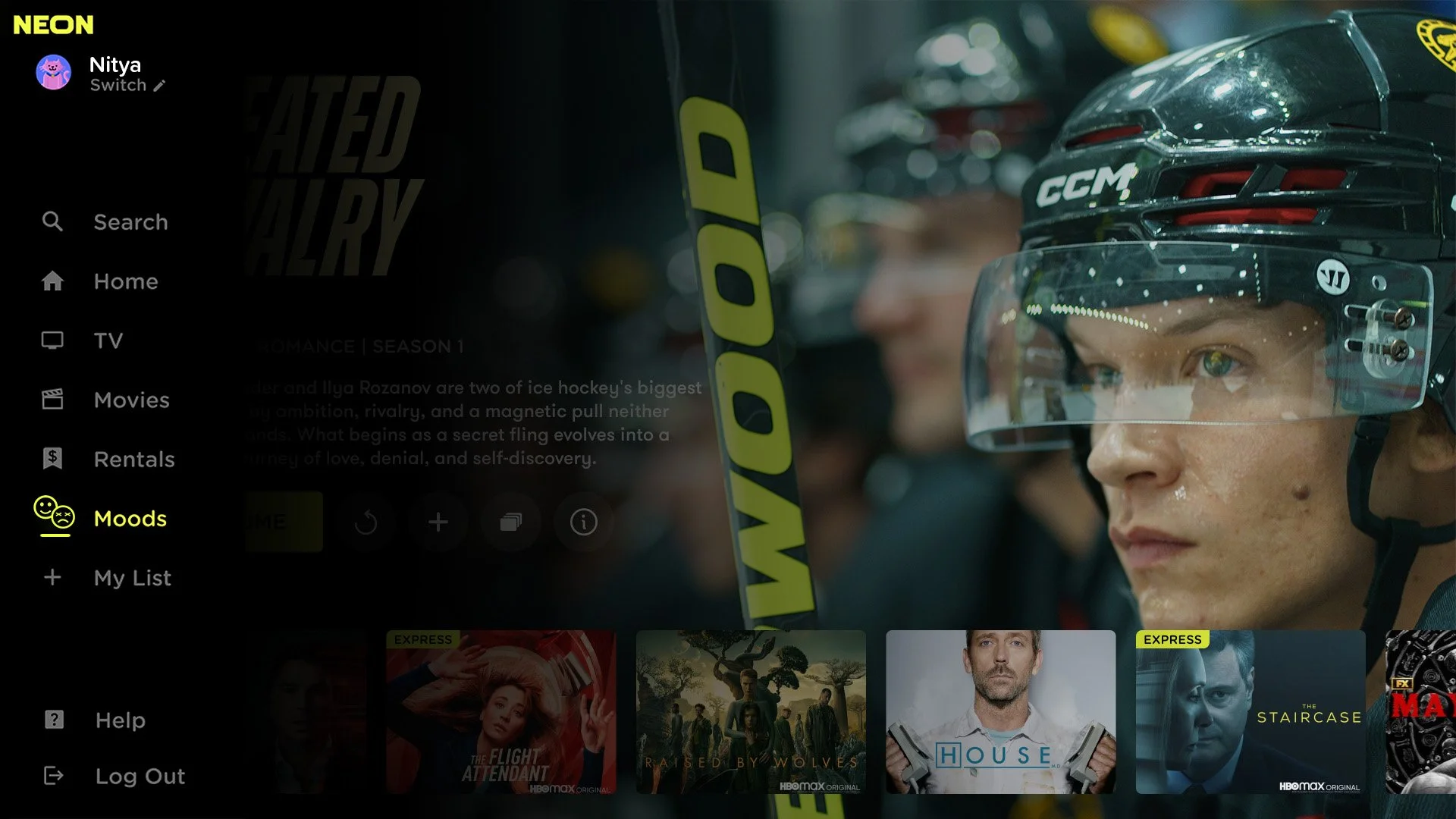
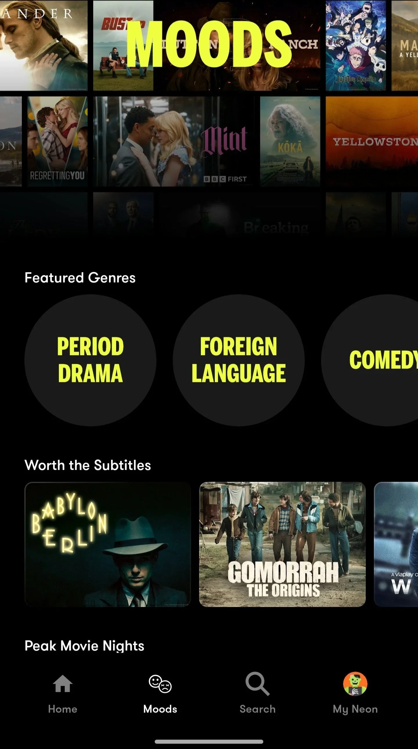
This extended to the design of the "Mood" genre icon for the refreshed NEON platform -
a small but considered piece of UI design that needed to feel cohesive alongside the existing icon suite on the platform.
Weekly engagement reached 71% of subscribers actively watching content - a three-year high, and up from a typical 50–55%.
Average viewing time climbed to 8 hours per week, from a baseline of 5.5–6 hours - also the highest recorded in three years.
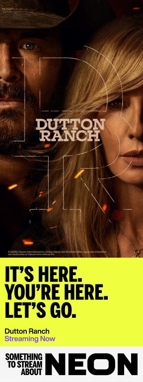


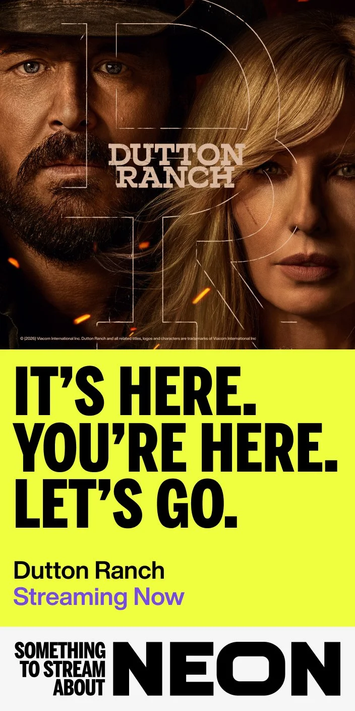

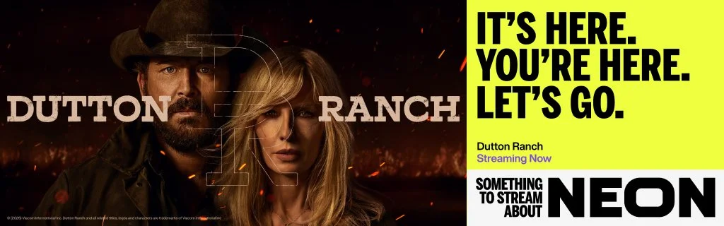


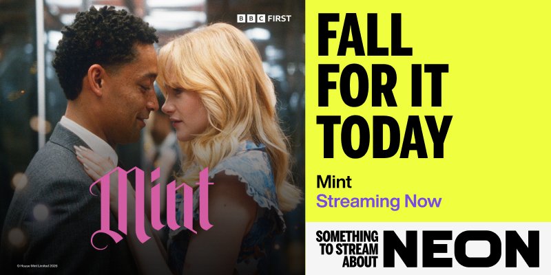

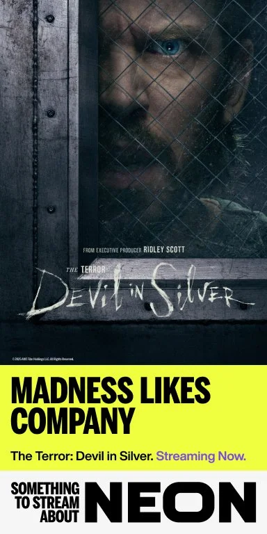


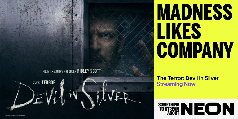
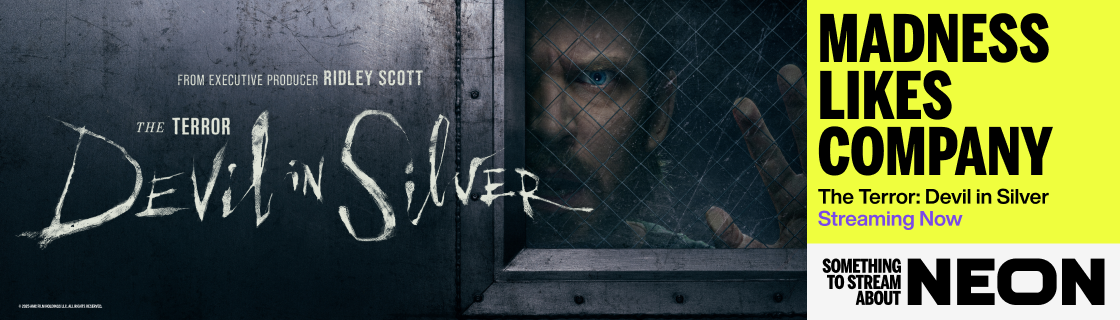
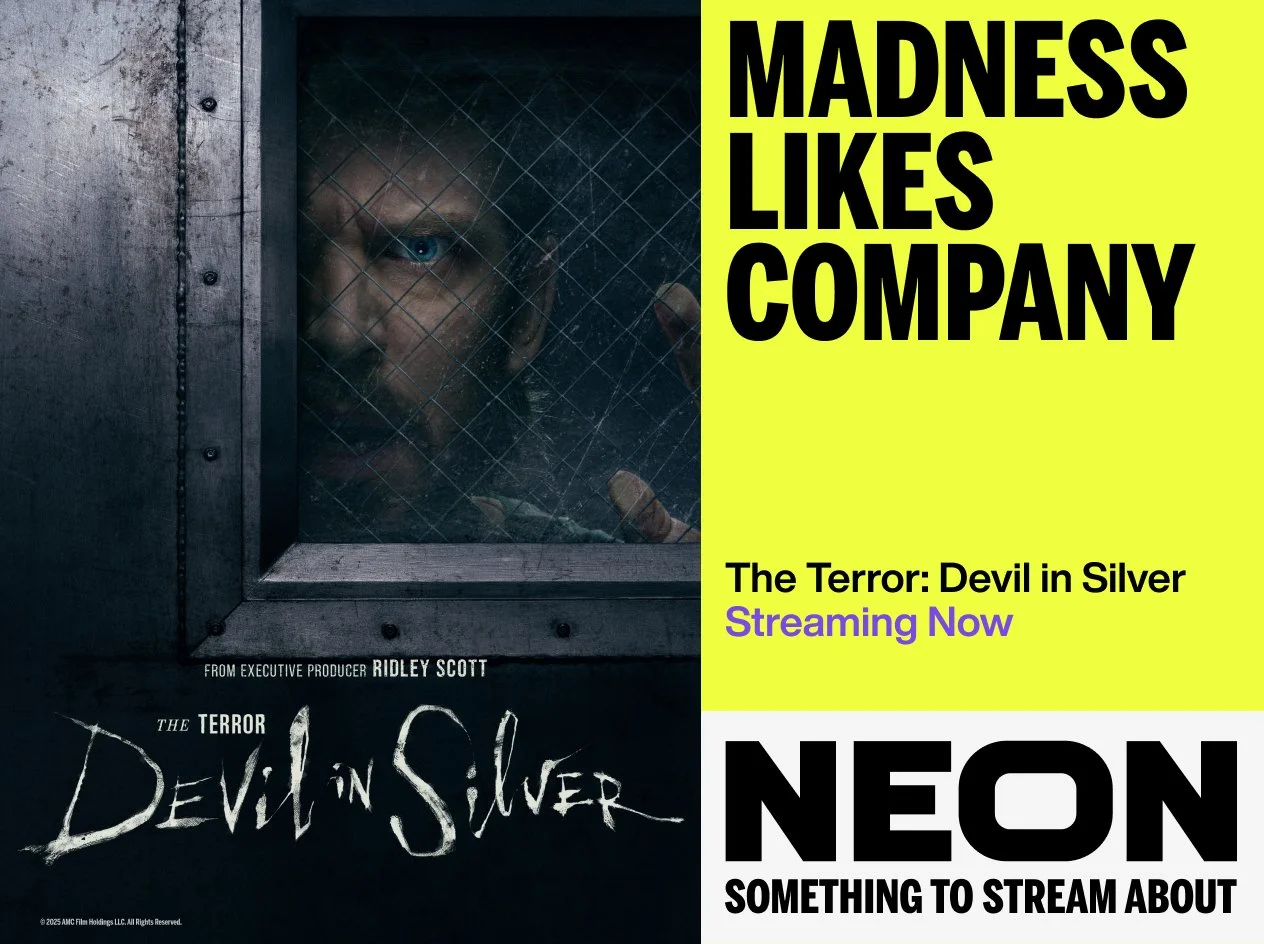


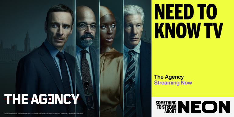
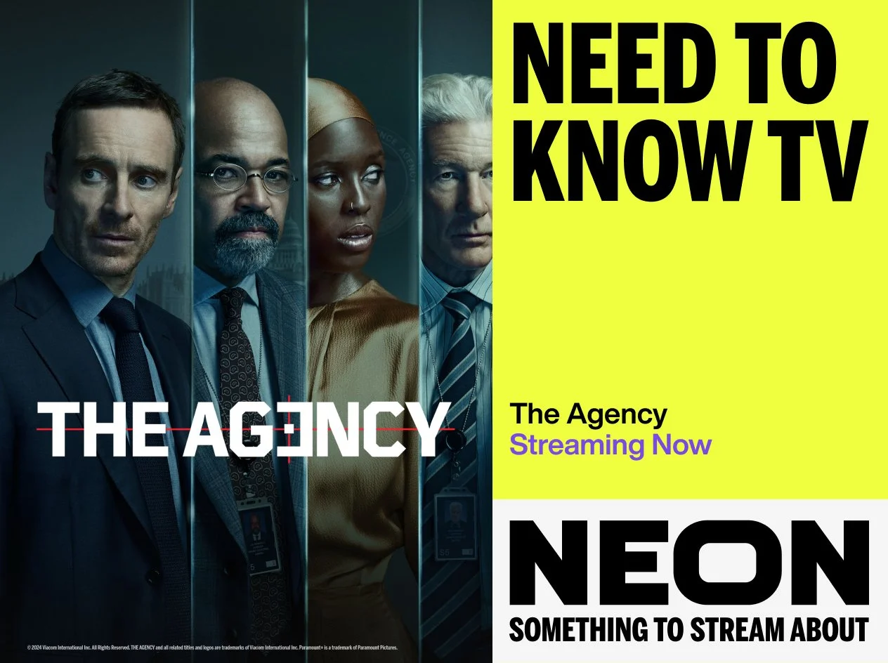


The project required adapting key art across an extensive range of formats - from large-scale street-side placements to expansive digital billboards.
Careful attention was given to typographic hierarchy and visual impact at every dimension, ensuring legibility of key messaging and a cohesive aesthetic across all executions.